M1 Fine Art gallery in Greenwich
I visited this gallery accidentally but it was one of the best experiences I have had so far with regard to small size art galleries. The works were displayed in an understandable order, in good light and appropriate space, all information about each work was written clearly and put next to the work, so that it was instantly clear which work belongs to which author etc. The gallery employees came to me to give more information about the displayed works and did not need to be asked to do that, which was a pleasant surprise. I had not encountered such initiative from employees in any other gallery. The works represented were by different authors, made in various styles and techniques. Mostly oil paintings but also prints, watercolour and acrylic paintings, sculptures, embroidery. Amazing collection of works. Very high quality. The represented authors:
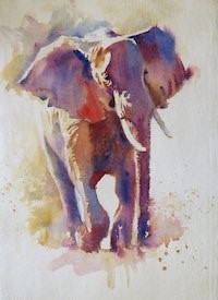
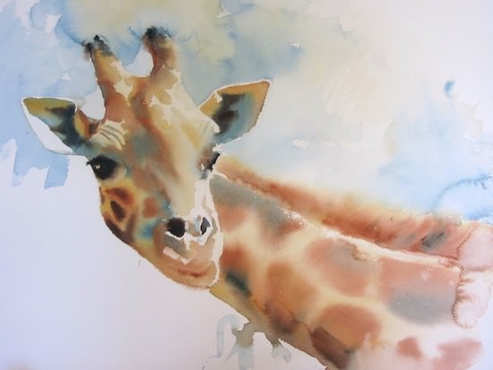 Hazel Soan – watercolour paintings of animals, people, city scenes. To make works like she does what is needed is great skill and talent. Watercolour seems easy to do but is very tricky as mistakes cannot be changed (like in oil and acrylic painting). One wrong touch to the paper and the work is damaged and has to be started completely from zero on a new piece of paper. To master watercolour technique one needs to spend years practising. The artist’s webpage hazelsoan.com is creative and original visually, nice colour schemes but it is completely chaotic, hard to navigate, non-understandable. I do not think that practical convenience has to be sacrificed to give prevalence to ‘uniqueness’ because for the possible client the main interest is to see the artist’ s works, availability, prices, contacts, possibly read about the artist and to do all this in a comfortable way that does not give headache or remind the Rubik’s cube. Hazel Soan is a great artist but unfortunately her webpage is a complete failure in my opinion.
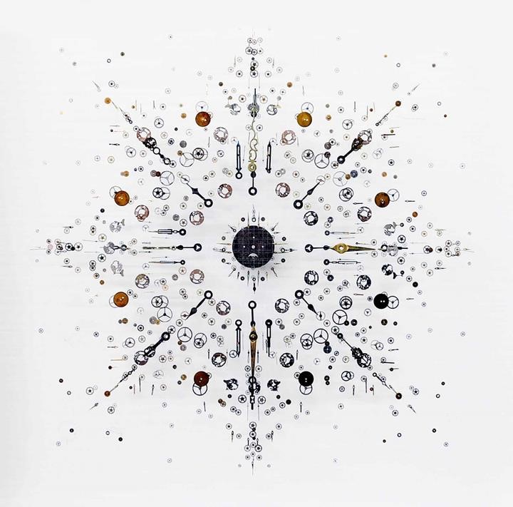
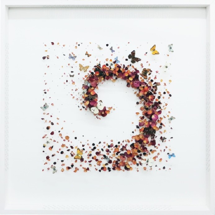 Anna Masters – very interesting, original works in a technique that I had never seen before. Mixed media. She uses frames, inside which there is a grid made of nylon strings. To the grid there are attached many small pieces, all together forming a shape, structure with compatible colours. The small details are butterflies, petals, gears. The artist’s webpage mentions the Chaos Theory, grids that are built up in layers, details that are suspended in mid-air, discarded watch and clock parts. The works look elaborate, even elegant, very precise and ‘clean’.
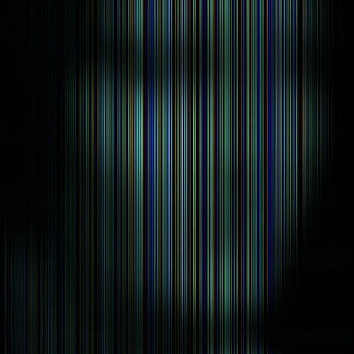
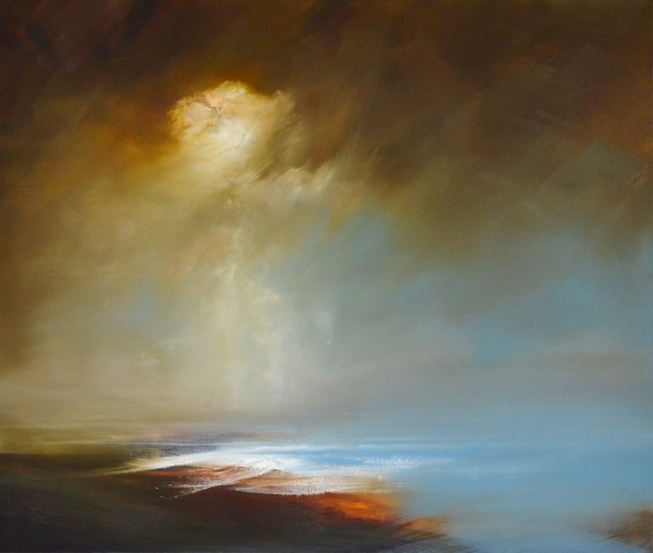
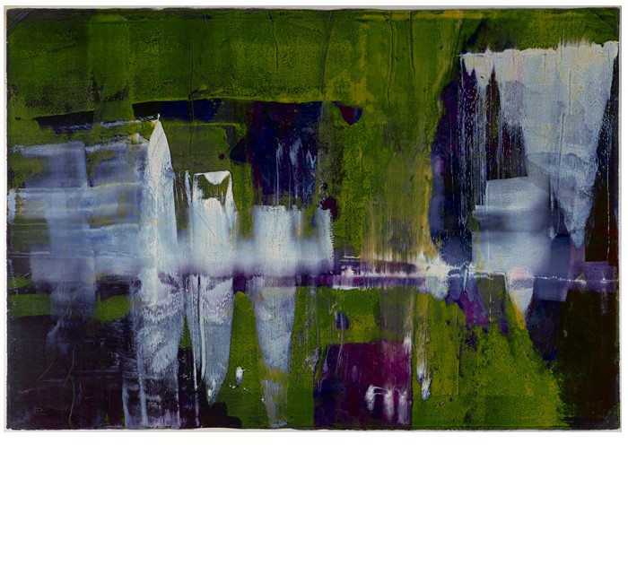
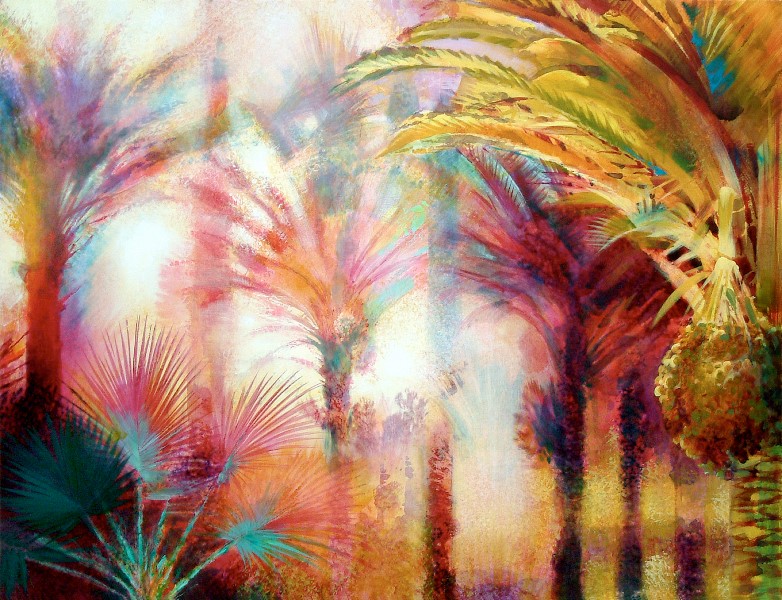
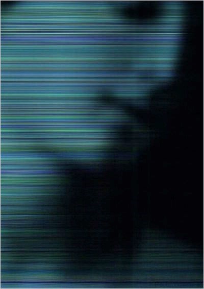 Paula Wilkins – the M1 gallery webpage describes her works as “the continuous mediation of a single image via mechanical processes. The mediated image evolves as it is processed through multiple mechanical methods, gathering unique characteristics at each stage which alter it through enhancement or degradation and dislocate it from its original state and intended meaning. Through experimentation and mechanical exploitation of borrowed images she [P.Wilkins] explores new ways to combine and capture idiosyncrasies, showing the potential for a new narrative through her resultant artworks”. These works reminded me of the artist Ritums Ivanovs who makes paintings that show the same colour scheme and ‘blurriness’ as Paula Wilkins’s images.
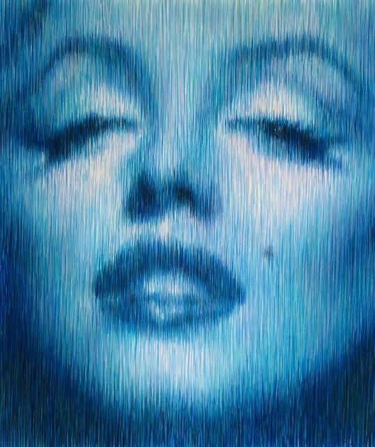
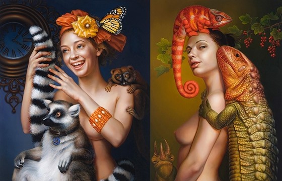
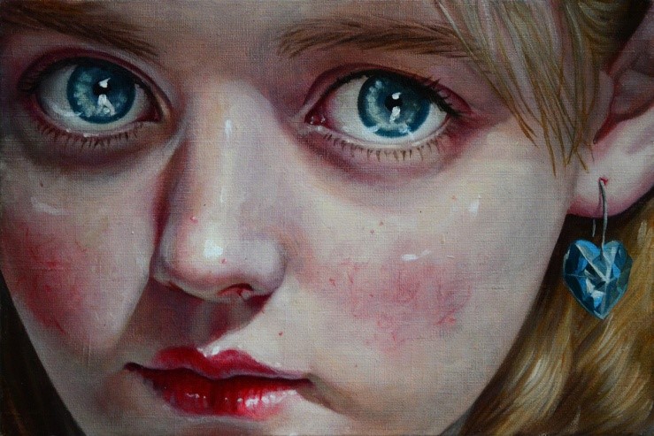
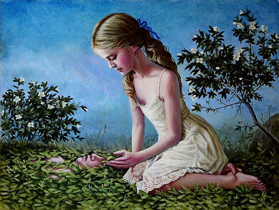
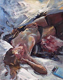
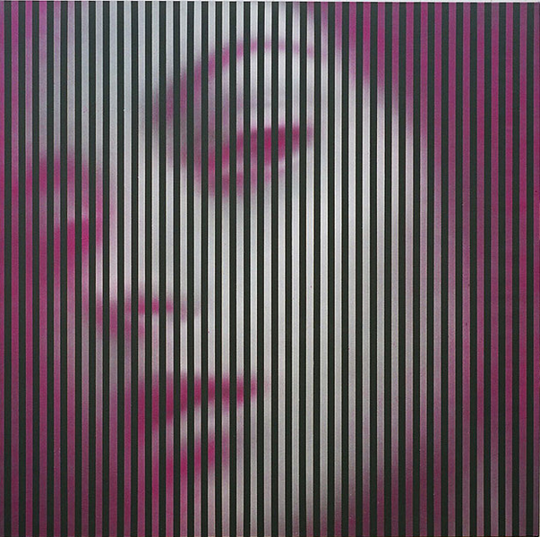 The 2 works shown above are by Ritums Ivanovs. His webpage describes him as “a Latvian painter who uses precise and hyperrealist depictions of reality and bright polychromatism typical of Op Art. Working in his unique linear technique, he paints portraits and nudes on exceptionally large-scale canvasses (up to 145 x 250 cm). Mr. Ivanovs most often uses a photo as a basis, yet sketches and paints his works completely freehand. The main subjects of Ritums Ivanovs’ works involve human emotional moods, in both dramatic and subtle styles. His images contain real people from his life, photographic images from printed material – from art history books or from show business advertisements, and even from erotic magazines”.
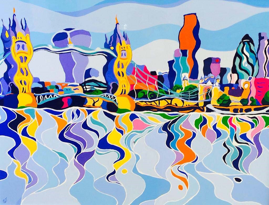
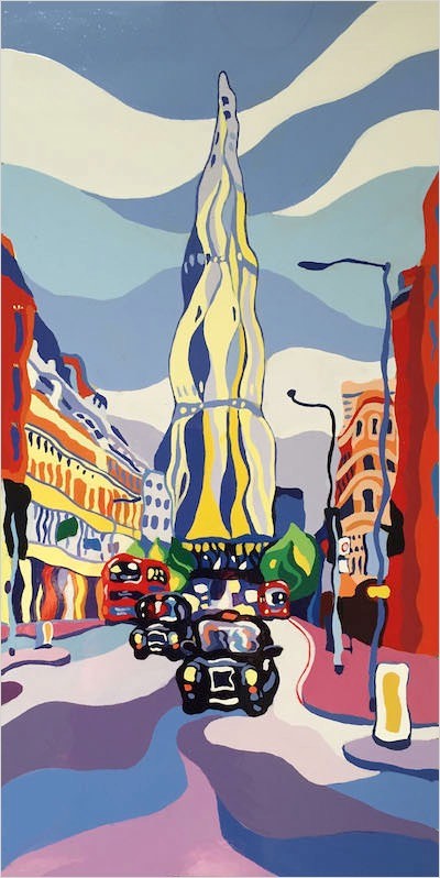 Sarah Fosse – portrays the stunning vistas of London using rich vibrant colours, energy and atmosphere. She has developed her own unique and instantly recognisable style, which has been inspired in some way by Fauvism. Her expressions have a joyful childlike simplicity yet are complex and sophisticated in their composition. The artist makes paintings on aluminium. I find her technique quite interesting and unique, although her style is somewhat already seen in works of other artists (distortion of shapes, enhancement of colours). The colours that she uses are similar in all her works and they seem childlike, a bit repetitive.
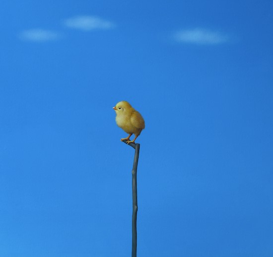
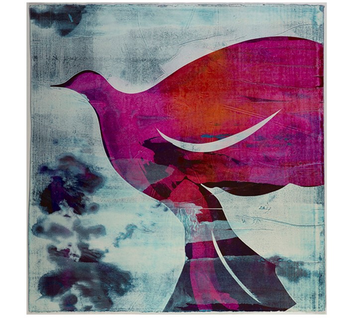
 Lilia Mazurkevich – http://www.liliamazurkevich.co.uk/ The artist’s webpage is very laconic and I would say representative of her works. Although it does not contain any additions or special design, it definitely goes together with the artworks as they themselves are exemplary. The photo realism is absolutely amazing and stunning. In the gallery I saw a couple of works of birds but in the webpage there are other works which shocked me with their detailed realistic nature and the highly professional quality.
 I would like to note that looking at these works I remembered a Latvian painter Jana Brike who makes works in a similar style. I personally don’t like Jana Brike’s works as they only make me think that her clients are pedophiles and perverts, although of course I appreciate any artist who is able to paint in hyper realistic way. In contrast with Jana Brike the artist Lilia Mazurkevich does not make openly perverted paintings but she has the tendency to show such elements in her works, however, in a somewhat hidden way. The women in her works are not victims but more like human beings who are in control of what they do and what they desire, they are not puppets like the doll-like children in Jana Brike’s works.
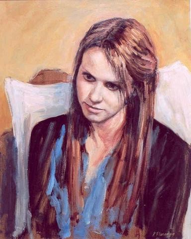
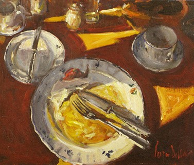
 Peter Flanagan – Peter describes his work thus: ‘In my work I try to balance strong draughtsmanship with a wide vocabulary of mark-making, looking for a poetic realism. I usually start a painting from life and then develop the work in the studio where I try to find a more imaginative, intense and distilled interpretation of the subject, to ‘move the senses by an intensification of reality’, as Lucien Freud puts it.’ https://peterflanagan.co.uk/ The artist’s webpage shows that he is a very diverse in his works and styles, I also noticed similarity with the traditional Latvian painting school – realism, tonal painting, still lifes, portraits, figures, cities.
 Alice Hall – she says: ‘All my paintings have been painted in situ. Plein Air painting is an exciting challenge, the aim being to capture the atmosphere and spirit of a place, while being truthful to the subject.’ Her works look like unfinished, as if they are sketches of something that will be made or paintings which are a starting point for the final works. Some of her works remind of Paul Cezanne’s landscape paintings although the similarity is not great. In general the works leave an impression of amateurism although they are not bad and definitely have the potential to become better.
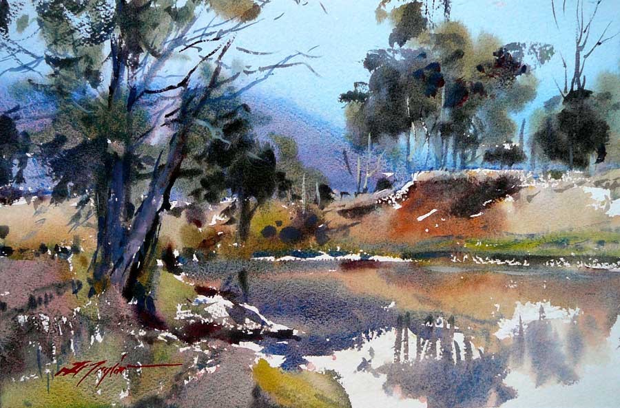
 David Taylor – David’s painting career expands many years of studying the art of watercolour painting and he has been involved in teaching his great love of this medium to painters both in Australia and overseas since the late sixties. There have been many varying influences on David’s painting journey and he is inspired by the impressionists Monet, Turner and the expressive John Singer Sargeant. Also Winslow Homer, Brabazon Brabazon and Whistler make the list. David is inspired by subjects that convey atmosphere mood and feeling. I am absolutely amazed by the artist’s skill, technique, colour vision, choice of composition.
 Helen Manning Clark – An established painter-printmaker whose abstract works affirm her as an incredibly gifted colourist. Glowing colours and painterly marks convey luminous, sensual and unique images inspired by flowering plants and both natural and urban landscapes. Dense textures and multiple forms help create these dynamic compositions, built up with overprinting and instinctive marks of bold colour. In other works Helen utilises delicate mark making and pale washes to form lighter sunlit images. Etching adds a further dimension with closely observed linear overprinting . Manning Clark values the abstract painterly qualities that monoprinting gives her but it’s her experimental and expressive use of the medium that works draw the viewer into the vivacious warmth of the artist’s imagination. I like the artist’s choice of colours and how she combines them. There is some similarity between her works and my own monotype prints. When she decides on different colour combinations I have to say I would select the same or very similar colours and their proportions.
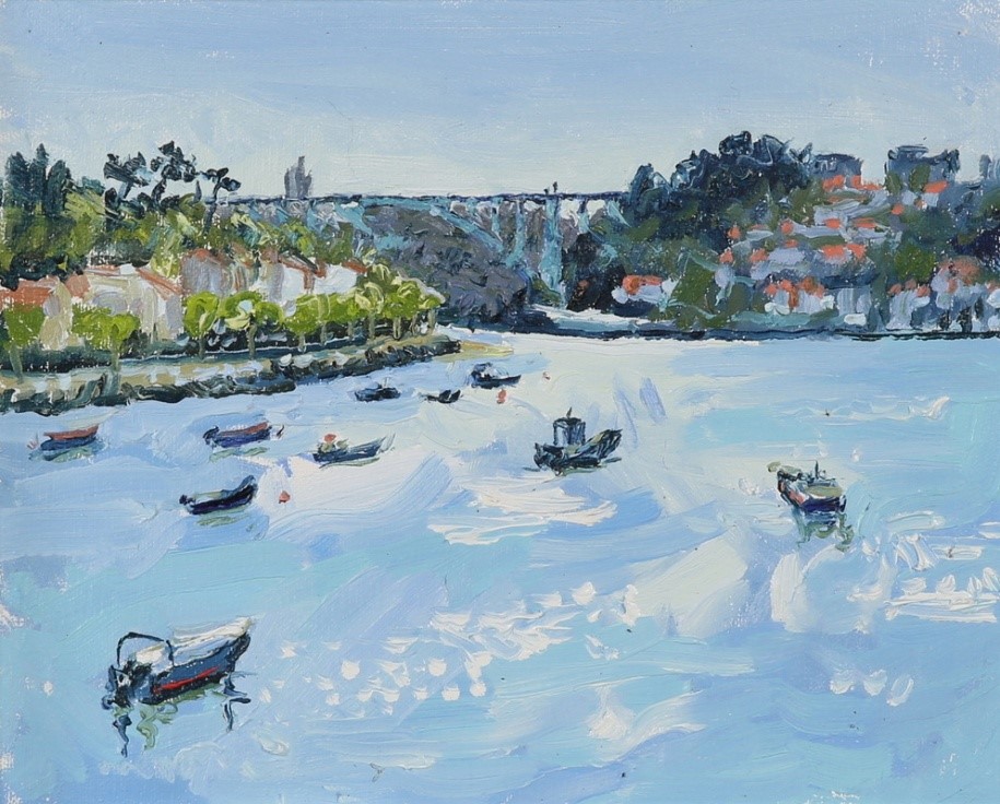
 Roger Dellar – He has a keen interest in people and their behaviour, and is fascinated by the way the play of light transforms a subject; either working in the studio or plein air. The artist’s style is classical, traditional painting, admirable technical skills. At the same time I do not see originality in his works.
 Nick Vivian – Nick’s interest in nature and ecology, but mostly his obsession with colour is what drives his artistic passions and so inspired by the natural world he has forged an international reputation for his distinguished work. Painting directly to canvas with a limited palette of six pigments that of course, aligning himself with the French Impressionists, does not include black. Much like a water colourist he uses the white of the support to give luminosity below numerous layers of translucent colour glazes, he achieves the secondary and tertiary colours by successive layering. My view is that the artist’s works are visually fascinating due to the way how he uses colours and I personally like such style very much but at the same time I have to say that he is repetitive and employs the same themes and scenes which makes one work amazing but all other works after that boring. He seems to be stuck in his style. It is like seeing the same dream every night with only slight changes.
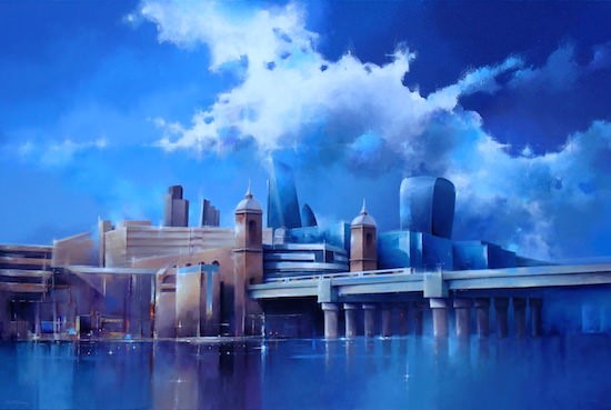
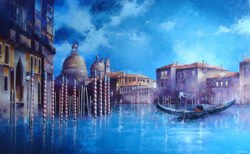 Jon Gubbay – paints in acrylics on canvas to create breathtaking unique images of London and Venice. His strong but subtle use of colour has established him as a sought after artist. In the last few years he has been specializing in large diptychs, eight or ten feet in length which are ideal for office receptions or larger apartments. It seems that the artist is a little obsessed with the blue colour. His works also seem to be detached from personal involvement – here I mean that the works lack emotion, passion or anything else human, they seem to be created by an indifferent artificial intelligence machine, there is nothing personal in them. And it seems that they do not say anything and do not have an aim or a meaning. They are like prints we can buy in home stores.
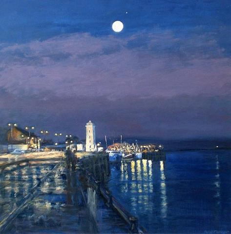
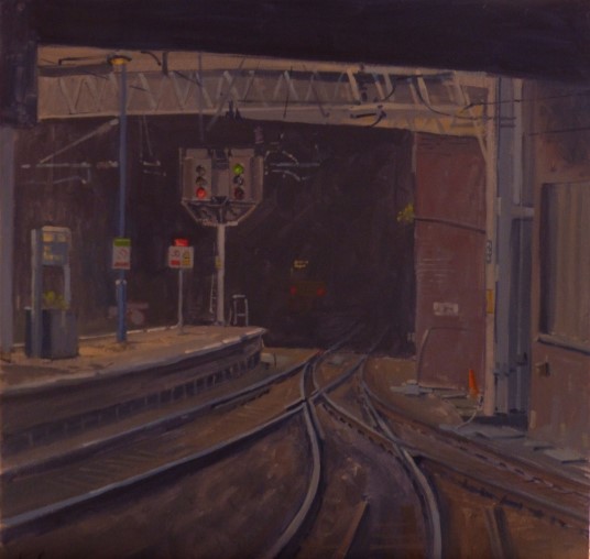 Ian Cryer PROI – best known for his oil paintings of landscape, railways, interiors and characters. His style has evolved as a result of many years working directly from life, this has given his work a freshness and spontaneity that are the hallmarks of his work. Although he does not like to be restrained by labels or a rigid working method “British Impressionism” is a cap that fits in many ways and English painters from the early 20th century but especially the 1930’s are very much an influence on his work. This artist works in realism style.
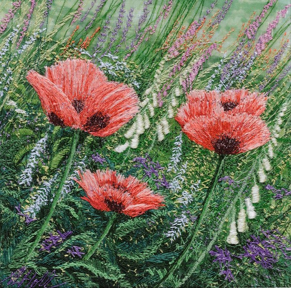
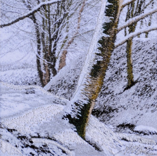 Alison Holt – a UK contemporary textile artist specialising in freehand machine embroidery. Using a basic Bernina sewing machine and just 2 stitches, straight stitch and zig-zag the artist makes embroidered pictures of landscapes, seascapes, flowers and garden scenes, influenced by the Shropshire Wales border near Oswestry where she lives and by her travels. http://www.alisonholt.com/ahthum.php The works of this artist are ones of the most amazing I have ever seen. The details are perfect and there is no other word how to describe it. Perfectionism at its highest point. The colour choice is masterful. The works I saw in the exhibition were tiny but I stood in front of them for a long time appreciating every milimeter of the small landscapes and flowers. Really exceptional art.
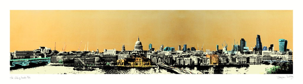 Jayson Lilley – a British contemporary artist who incorporates the practices of painting, collage and printmaking. He is recognised for producing works of urban scenes and iconic architecture. With influences coming from Japanese Ukiyo-e and Constructivism, Jayson has great admiration for the work of Katsushika Hokusai and Alexander Rodchenko. His love of early 20th century Art Deco and Bauhaus to the Brutalism of the post-war period is evident throughout his work. Characterised by its strong compositional structure and a limited palette, Jayson uses high contrasts with light and shadow to convey form and silhouette defined by his clean lines and large areas of flat colour. When seeing the artist’s works one of my first thoughts was about their similarity to Japanese art and minimalism and afterwards when I read about the artist and his inspirations, my initial ideas got proved right. Just like the artist I am also interested in Japanese art, oriental traditions, cultures, the way how Japanese people express themselves.